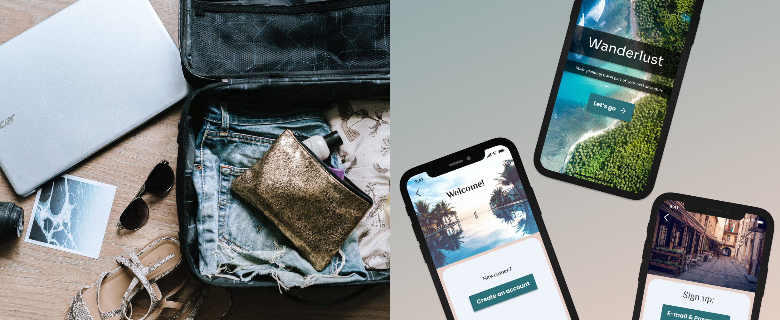
Wanderlust
A mobile travel app case study
When it comes to planning an exciting trip, no one wants to be stressed about the details. Especially for those travelling on a budget, planning travel can often feel like a never-ending stream of prices and deals. ‘Pull the lever and see what you get today!’
There is a clear opportunity for solutions. While changing budget may not always be an option, with the right tools available, people can find better, more fulfilling and exciting ways to go about planning and maintaining the details of their travel experiences.
Case Study prepared for: UX/UI Bootcamp, University of Texas at Austin
Timeline: 4 weeks | Project Dates: 10/13/2020-11/14/2020
Wanderlust:
Make planning travel part of your next adventure
.
My goal of this project was to create an app that delivers a fun, inviting and relaxing experience that gets users excited about their trip rather than stressed out about the details. The main focus is group travel, but the app can equally be utilized for the individual.
MY ROLE & RESPONSIBILITIES:
UX Researcher / UX Designer
(sole contributor)
THE PROBLEM
Planning group travel is disorganized, complicated and stressful. There are too many individual sites to keep track of. Plans/itineraries/ideas get lost in email threads and in busy, disorganized chats. Split payment is spotty, and there is no central place to plan and collaborate with groups.
THE SOLUTION
A collaborative travel app that creates a fun, inviting and relaxing experience and gets you excited about your trip rather than stressed out about the details.
VALUE PROPOSITION STATEMENT
My organization, Wanderlust, is developing a new collaborative travel app to help solo and group travelers on a budget solve their disorganized and overwhelming planning processes. We're better because our app makes planning your next trip something to look forward to, from start to finish--and beyond. We’re believable because we make planning travel a positive snapshot in your next adventure.
THE PROCESS
1. EMPATHIZE
Gather data with interviews
Synthesize data / Affinity diagram
2. DEFINE
User persona
Define user insight / Problem statement
3. IDEATE
Brainstorm solutions / Prioritize Features
Storyboard / Journey Map / User Scenario
4. PROTOTYPE & TEST
Sketch / Prototype / Test
Mid-fi Wireframes / Prototype / Test
Hi-fi Wireframes / Prototype
USER RESEARCH
1 Proto Persona. 5 User Interviews. Lots of data.
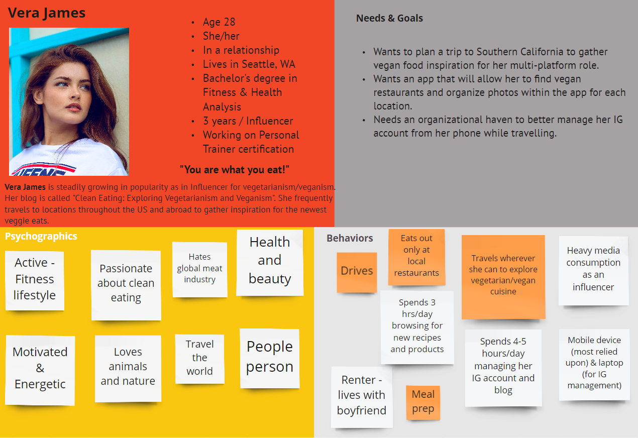
PROTO-PERSONA
Before diving into interviews, I created a proto-persona to have an anchor to work with while I was gathering data.
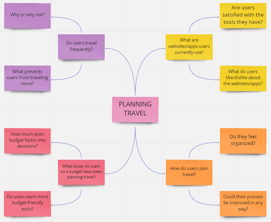
TOPIC MAP
I brainstormed with a quick topic map to formulate my Interview Plan and start a competitor analysis (Travelocity, Expedia, Airbnb).
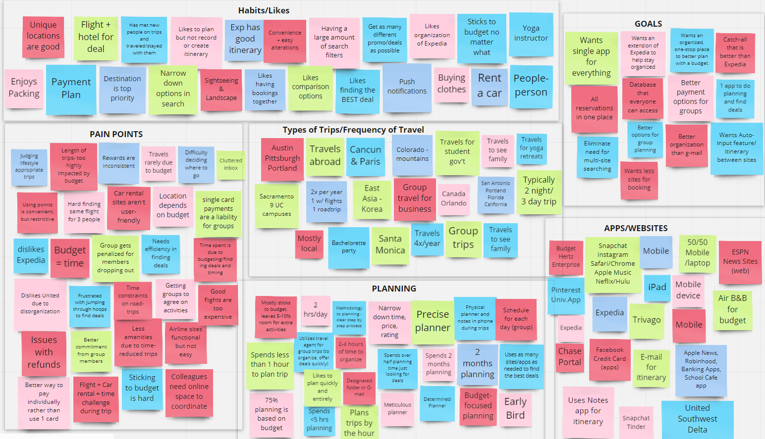
Interviews to Analysis: AFFINITY DIAGRAM
After conducting the interviews, I gathered key artifacts from my notes and synthesized the data with an affinity map to continue defining the user.
PAIN POINTS DISCOVERED:
Group planning is messy and dramatic
Lack of split payment options for groups
Travel sites are disorganized
Using multiple sites is difficult to keep track of
Overall entire planning process is disorganized
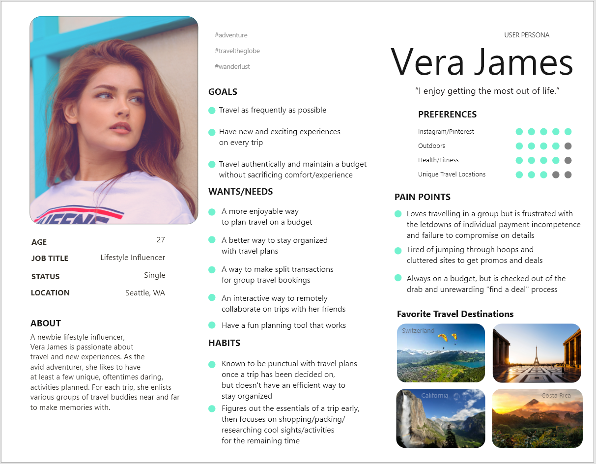
USER PERSONA
Once I had identified clear pain points, wants, and needs, I was ready to create the user persona.
Meet Vera James:
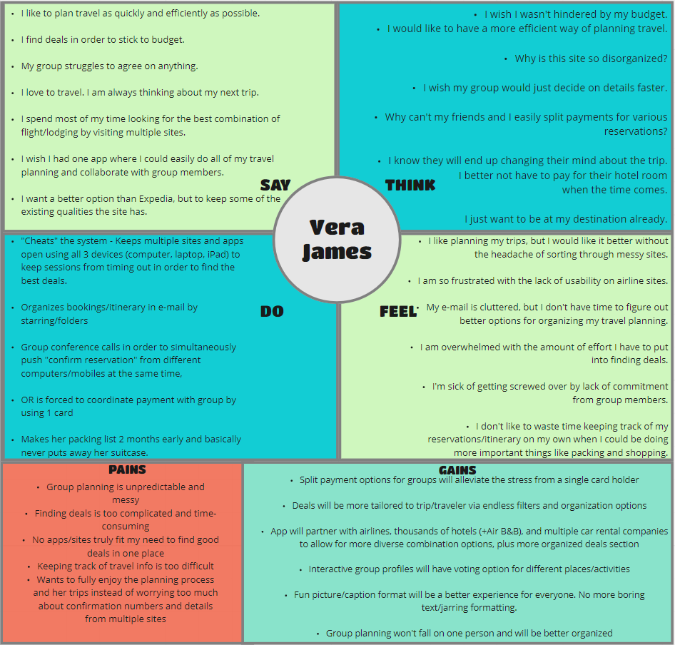
EMPATHY MAP
To dive deeper into the persona, I created an Empathy Map in order to decipher what Vera might:
SAY : “I love to travel. I am always thinking about my next trip.”
THINK : “Why is this site so disorganized?”
DO : Organizes bookings/itinerary in email by starring/folders
FEEL : I like planning my trips, but I would like it better without the headache of sorting through messy sites.
IDEATION
Vera James was born.
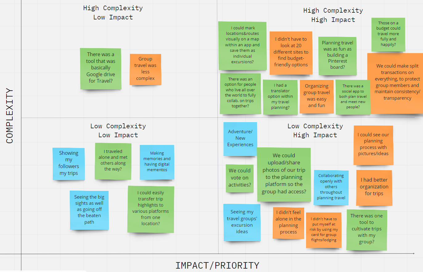
I began the ideation phase with more brainstorming.
I filtered my findings with a matrix to prioritize features that provided solutions for her problems.
FEATURES
A sleek, resort-style app that transports the user in the experience
Personalization options - Profile, Trip Pages, etc.
Group collaboration & Split payment options
Trip memories page that allow groups to share and store trip photos without the worry of social media privacy controls
USER INSIGHT
“As a highly social adventurer, Vera James needs a way to effectively plan remotely with her travel friends, due to her budget constraints that allow her to travel comfortably only when splitting costs with a group and her desire to share her experiences with others.”
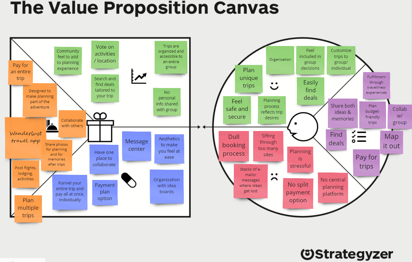
VALUE PROPOSITION CANVAS
To further tighten up the features and visually correlate the solutions to user needs, I utilized the Value Proposition Canvas (Strategyzer).
Time for a script run-through
With the features and solutions clearly defined, I began developing a User Scenario and Storyboard.
User Scenario: “Vera James is set on taking a trip to Japan with a group she recently met on her last trip to Europe. She had a blast with the group and can’t wait to plan a full trip with them. However, she’s found out they aren’t really the organized bunch, and neither is she. They are struggling to effectively communicate with one another via e-mail, and her inbox is getting fuller by the day. The timezone differences also create issues. Someone suggested they switch to a group text, but Vera shut that down fast (no way is she getting her phone blown up at 2am!). Vera finds Wanderlust and immediately switches the group over to the app...”
STORYBOARD
SKETCHING - WIREFRAMING
USER FLOW
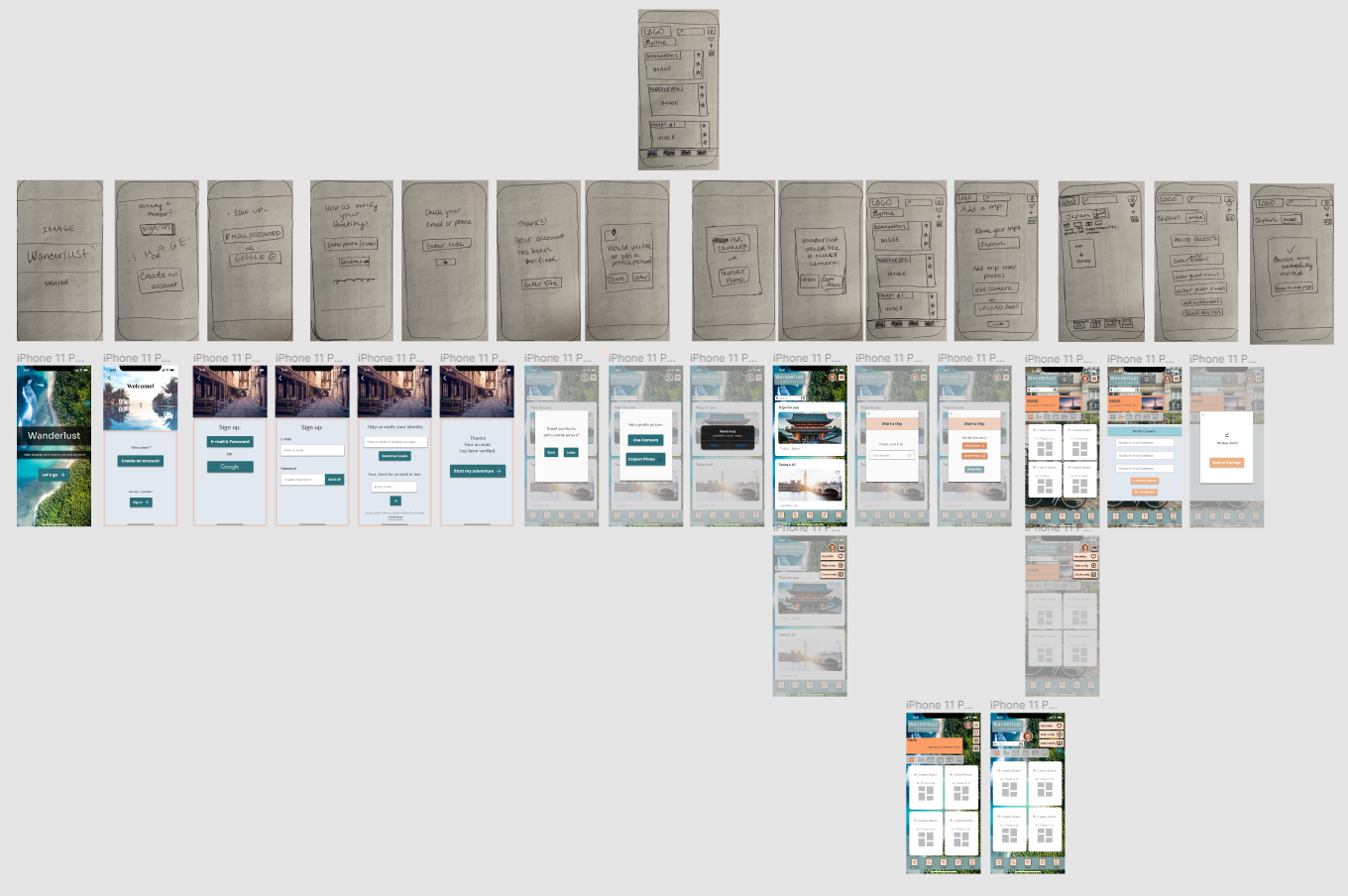
Ready to begin with pen & paper, I drafted a user flow before sketching.
SKETCHING & PAPER PROTOTYPE
Home feed and trip page:
LOW-FIDELITY WIREFRAMING
USER TESTING
With the mid-fidelity prototype, I completed 4 user tests.
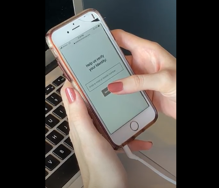
In order to get quicker results, I did some guerrilla testing.
A guerrilla test—conducted at none other than a Starbucks!
What I gathered:
The sidebar icons functionality were not understood
The icons needed to be changed to a hamburger menu
Icon/task bar on Trip Page was well-received
Sign-up process was quick and easy
HIGH FIDELITY WIREFRAMES
The goal
Wanderlust provides a more viable option than products within the current market by eliminating the need for an overwhelming amount of sites and tools. With trip board collaboration, organization is natural rather than forced. Users can be excited about planning, have a better focus on their next adventure, and enjoy smoother travel experiences as a result.
LOOKING AHEAD
Let the adventures begin! But first…iteration, iteration, iteration.
Future Goals:
Test the final mock-up
Flesh out the remaining features of the app
More testing
Develop the app and go live!

