Austin Creative Alliance (ACA) Redesign
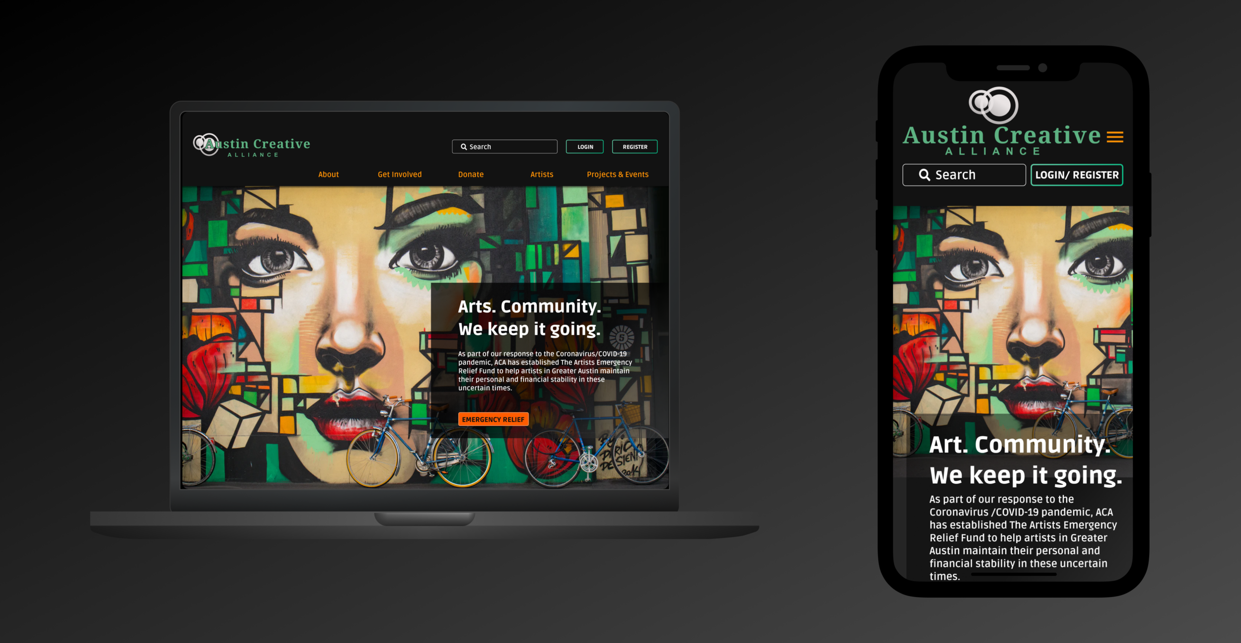
The COVID-19 pandemic has brought artists more hardship than ever. Due to the shutdown of live showcases, nearly all public events, and consequent lack of networking opportunities, artists are desperate for relief options to both help them stay afloat and keep momentum going during this time of hardship. Our redesign of the Austin Creative Alliance (ACA) website simplifies the relief fund application process while providing a space for artists to showcase themselves to donors and network and collaborate with other artists.
Case Study prepared for: UX/UI Bootcamp, University of Texas at Austin
& Austin Creative Alliance (as a donation)
Timeline: 2 week Design Sprint | Project Dates: 1/21/2021-2/6/2021 | Team of 3
Austin Creative Alliance Redesign:
A solution to help the Austin arts community both stay afloat during COVID-19 and thrive in the future.
Our goal of this site redesign was to provide a creative space for artists to promote themselves digitally and network with other artists and potential supporters. In addition, we wanted to boost access to relief funding for today’s hardship, while planting seeds for ongoing support for the Austin arts community beyond the pandemic.
MY ROLE & RESPONSIBILITIES:
UX/UI Designer
User Research
User Persona
Information Architecture / Sitemap
Sketching & Mid-Fidelity Design
Usability Testing
Mockup Design (Interactive Artist Directory, Mission Page, Relief Fund Application)
THE PROBLEM
An artist in the current pandemic world needs better access to funding and a digital platform to showcase their work in order to better connect to new clients and potential project donors.
OUR HYPOTHESIS
We believe an artist-focused platform will enable new and existing artists to easily and quickly promote their art as well as find the necessary funding to help them maintain their quality of life through the duration of the pandemic and into the future.
THE PROCESS
EMPATHIZE
Gather data with Interviews / Surveys
Synthesize data / Affinity Diagram
DEFINE
User Persona
Define user insight
Solidify a problem statement
IDEATE
Brainstorm Solutions
Prioritize Features
Re-design Sitemap
PROTOTYPE & TEST
Sketch / Mid-fi wireframes / Prototype / Test
Define Style Guide
Design Mockup / Prototype / Test
USER RESEARCH
I developed an interview plan that allowed us to get to know our interviewees while honing in on pain points and their wants and needs. We individually conducted 5 interviews with potential & current users (local artists across various mediums) and surveyed 20 artists and art supporters.
My main contributions:
Interview Plan | 1-1 Interview with an Opera Singer | User Persona
ACA current site navigation (as of January 2021)
We kicked off the project with a thorough heuristic evaluation and annotation of the current site. After analyzing the site and the many potential opportunities it offered for redesign, we were able to start defining the user and begin scheduling interviews.
AFFINITY MAP
We synthesized the data from our research and interviews by categorizing user pain-points, feelings, wants/needs:
Our team worked remotely, so we collaborated using Figma and Miro.
INTERVIEWEE DISCIPLINES:
Opera Singer
Painter
Clay Artist/ Potter
Photographer
Band Member Musician
PAIN POINTS DISCOVERED:
Lack of funding options
Lack of networking opportunities
Cancellation of live events
Digital lens/recording takes away from live experience
USER PERSONA
After the initial research was complete, I was able to develop a persona.
Meet Jared Williams:
IDEATION
Once the persona was defined, we began the ideation phase with brainstorming using the “I like...I wish...What if?” method.
We filtered those findings with a prioritization matrix to settle on our features.
My main contributions: Information Architecture | Sitemap
FEATURES
“A Day in the Life”: Artist Studio Showcase
“Featured Artist” opportunity to boost networking for individual artists
“Fund an Artist” feature
Artist collaboration opportunities
CARDSORTING
Once we decided on our features and potential solutions, we began digging into the Information Architecture.
First, we recruited multiple users for an open card sort, using Optimal Workshop to quickly and efficiently gather data.
Utilizing the results, we did a few open card sort iterations as a team before we began structuring our sitemap.
SITEMAP
For our sitemap revamp, we added new feature pages and shifted the navigation to focus on the artist while keeping accessibility for donors and visitors. After we did many iterations as a group on page names and navigation elements, I created our sitemap, implementing a numbering system and hierarchy. The final sitemap shown is an iteration completed after our mid-fidelity testing.
SKETCHING & MID-FIDELITY TESTING
With the completion of our shiny new sitemap, we dove into sketching our redesign. We each sketched a version of the homepage, voted on what we liked about each design, and came up with our low-fidelity wireframe as a team. The mid-fidelity prototype was driven by my wireframes, which ultimately largely influenced our final design.
My main contributions: Group Reference Sketch | Mid-fidelity wireframes (homepage, artist landing page, mission page)
SKETCHING - MID-FIDELITY
After our vote, I sketched a reference for the team to keep us on the same page for mid-fidelity design.
Mid-Fidelity Homepage: My version
Mid-Fidelity Homepage: Group version
MID-FIDELITY TESTING
Upon solidifying our mid-fidelity wireframes as a group, we created an InVision prototype to test our new navigation and Relief Fund Application process. We wanted to be sure the application was easy to find and that the user could complete it quickly.
My design: Mission page
My design: Artist/Funding landing page
WHAT WE LEARNED
Users were confused by some of the spacing between the Primary and Secondary navigation
Some of the Secondary Navigation categories were not clear
Getting to the Mission page was clear, but getting to Funding was not easy
UI STYLE GUIDE
After testing our Mid-Fidelity prototype and iterating our design, we began designing our mockup. Drawing inspiration from “Spotify” to propel our design, we utilized a dark background with bold accents to keep the focus on the art.
My main contributions: Image Selection | Navigation Bars | Button States
HIGH-FIDELITY TESTING
One of my high-fidelity 5-second user tests.
As we came upon our two-week deadline, our hi-fidelity testing was done mainly the work out the kinks of the secondary navigation bar.
The team was at odds with a fly-away navigation bar versus an anchored bar. After a usability test and a vote, the answer was clear: stick with the anchored bar.
What we learned, but didn’t have time to fix:
The hero image on the Mission Page was a bit overwhelming to some users.
The animation of the bar on the secondary navigation was not always smooth.
MOCKUP / INTERACTIVE PROTOTYPE
My main contributions: Interactive Artist Directory | Mission Page | Relief Fund Application
Interactive Artist Directory
Even with our deadline fast-approaching, I was able to implement a concept I had been inspired to create early in the design process.
My goal: to dramatically showcase a handful of artists while giving the user a compelling experience.
My thought process: The group of artists would either change quarterly or be on a weekly/monthly schedule to allow everyone the chance to be featured. Alternatively, there could be multiple pages of the photo directory, with arrows on either side for the user to click through. However, the latter would involve a lot of images for the user to digest. The original version provides an interactive experience without overloading the user.
You guessed it: More testing is needed to refine this feature.
Mission Page
With every non-profit, there is a continual need for support. The existing website does not have a mission page, which we felt was a glaring flaw. My thought process for the design of this page was to provide potential donors visiting the site with the confidence that the arts community the ACA represents is worth the time (and money). The image also gives the artist user a sense of pride that they may not often get from the community at large.
Emergency Relief Application
The site’s original application was a “typical” stressful and uninviting process with a one-page form. My goal was to provide a more delightful tone, with a progress bar and images to make the artist feel at ease.
MID-FIDELITY to MOCKUP
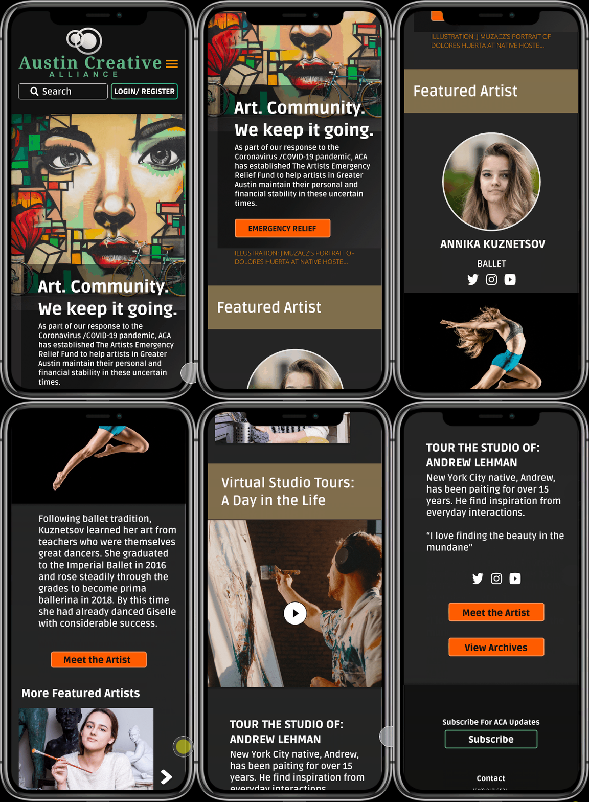
Our dramatic redesign allows artists to quickly access emergency relief, while feeling right at home with a beautiful, inviting hero image (a testament to Austin’s famous street art scene). In addition to the bold emergency relief button, artists can immediately navigate to the Artists tab to check out the resources available to them. Existing and potential donors are drawn in by the main features on the homepage: “Featured Artist” and “Virtual Studio Tours: A Day in the Life”.
My mid-fidelity design
Homepage Mockup
LOOKING AHEAD
Overall, our redesign completely transformed the site from a mundane, information library to a useful and creative space for artists to thrive and for existing and potential donors to make contributions to both the non-profit and the individual artists it supports.
Future Goals:
Refine the full artist directory list (non-interactive section) with artist mediums and filtering options
Conduct full interviews with stakeholders (we were unable to get in touch with the CEO for the duration of the project)
Fully execute a mobile mockup
Conduct more user tests with potential donors, first-time visitors, and artists


